DISCOVER CACIQUE | The Art of Colour
“There is a reason we don’t see the world in black and white.”
At Cacique, we approach every event, every meeting, every experience like a blank page. We imagine, we sketch, we design. When it’s time to take out our paints and put brush to canvas, we must choose a colour palette from which to work - But what goes into that process? What dictates the shades, tints or hues that we settle upon?
Colour is foundational - it’s where we start. It’s so central, so unifying across mediums, that it ties directly into an event’s theme, and for that reason it must be considered from the outset. Colour choices can cascade into all other design decisions, from florals to lighting options, to the venue itself. Join us for a polychromatic trip through our recent portfolio to see just how we harness the power of colour in the endless pursuit of design magic…
Start Strong
There is no doubt that colours command psychological power. Each and every hue resonates with separate slices of the emotional spectrum. Red is energising; an attention-grabber that can portray love, strength, or gusto. Green is rejuvenating, and evokes balance and harmony. Blue is calming and builds trust.
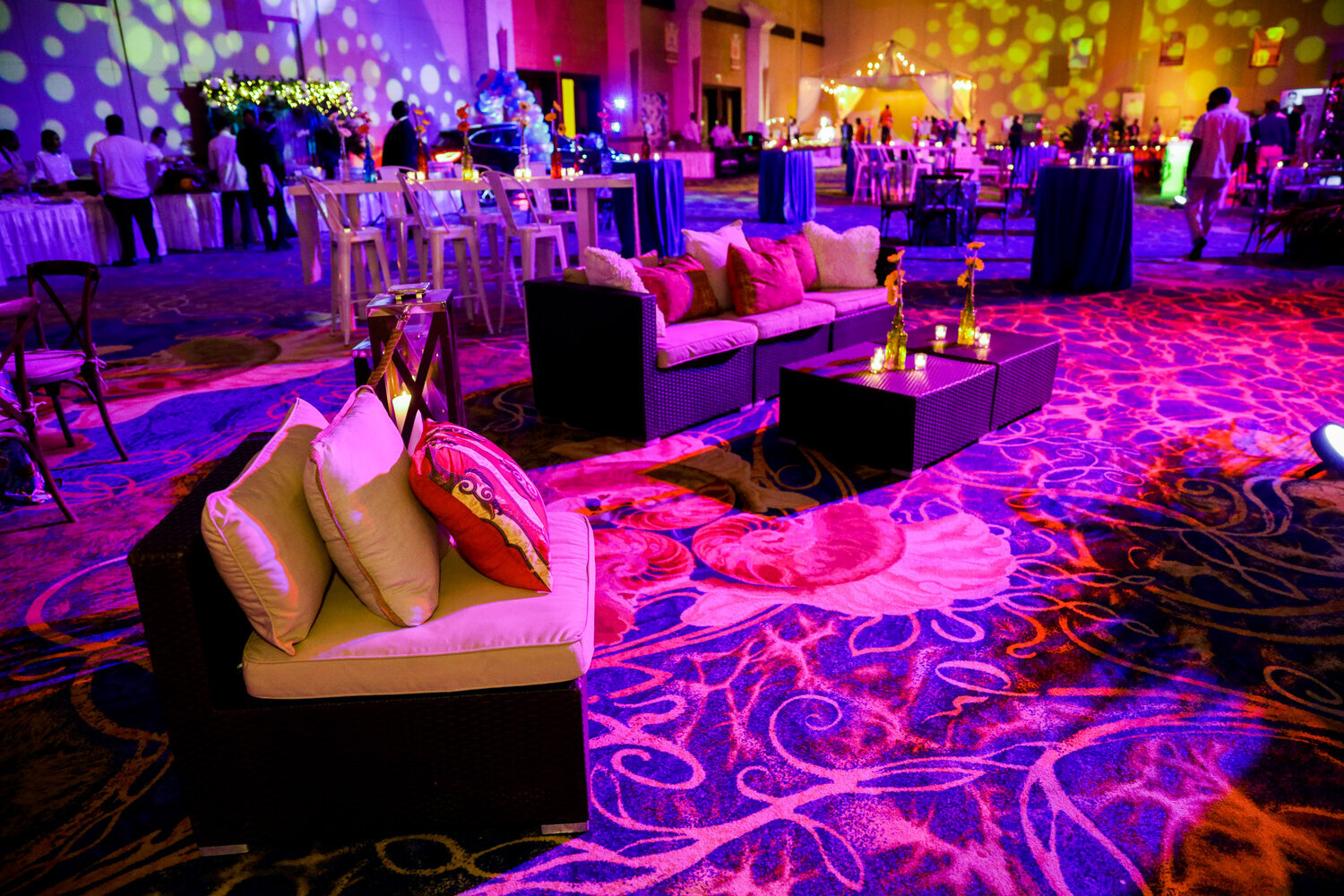
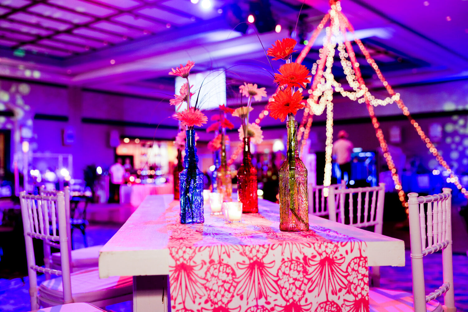
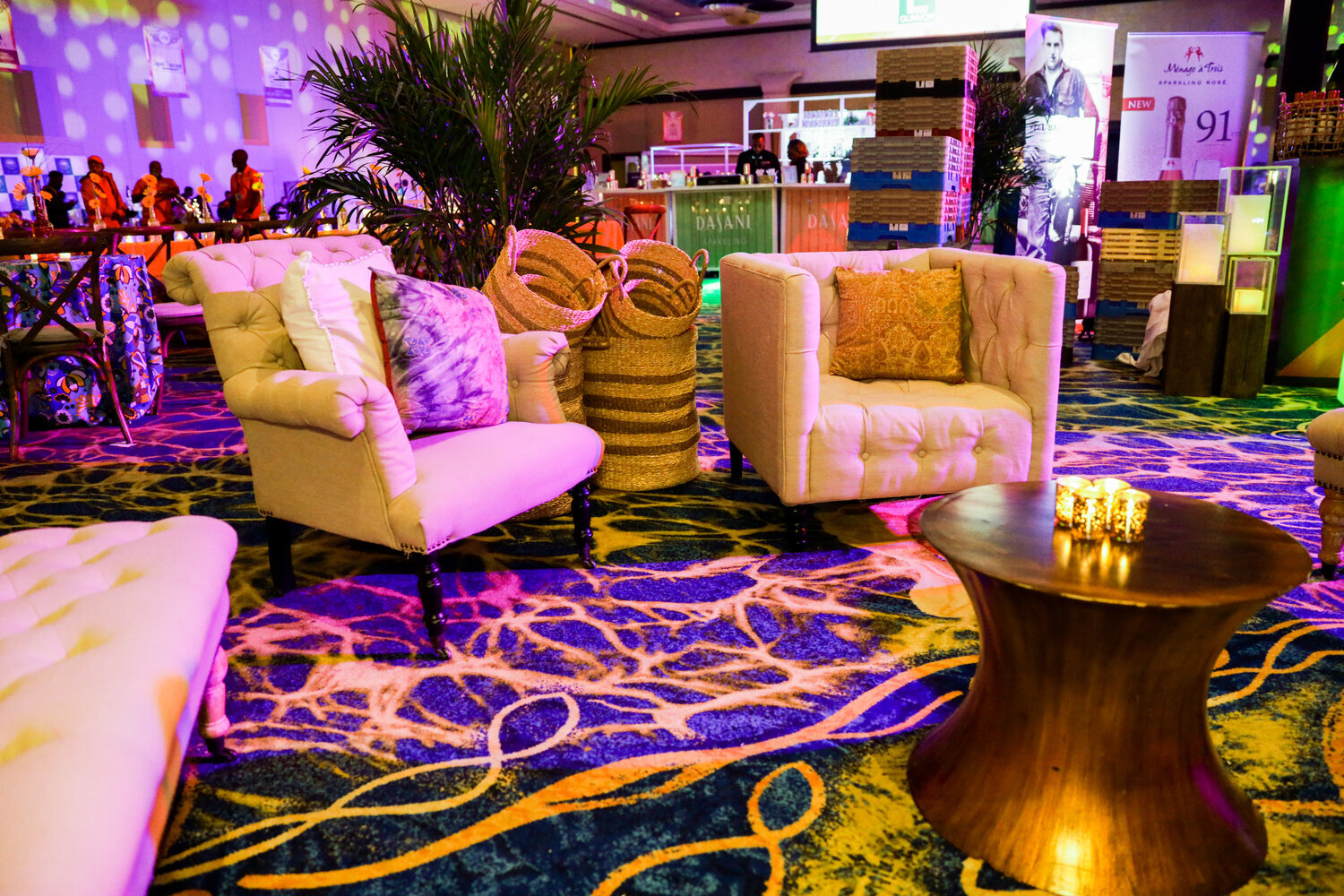
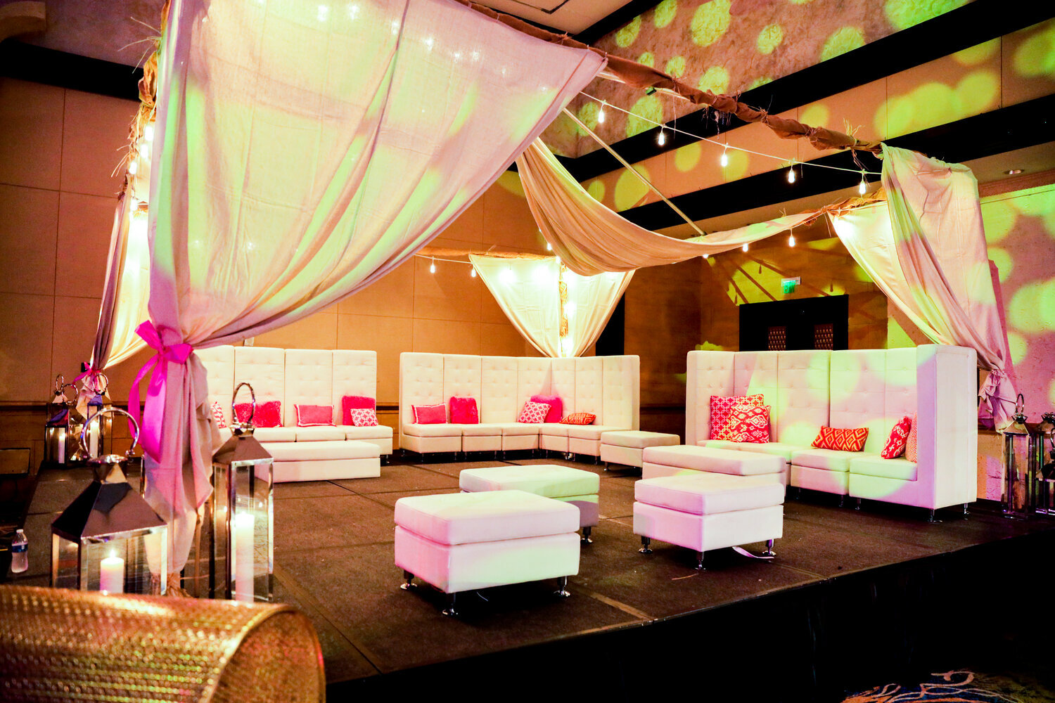
Just as the the music and the menu are chosen to meet the grander vision, the wise event designer will pick colours that evoke the target emotions we want our guests to feel. From this, the more tangible design elements, like table scapes and floral arrangements, can be strategically selected. While the gobo lighting, seating styles and throw pillows played their part, it was the opulent colours that really put the GLAMOUR in Hands for Hunger’s Glamping in Paradise. The earthy rustic browns gloriously clashed with rich pink, purple, and gold hues to highlight the dichotomy of “glamorous camping.”
Know When to Hold Back
In deft hands, colour can catalyse emotion, or trigger recognition – it is indeed a powerful tool. However, with power comes the potential for abuse, and knowing WHEN to use colour is just as important as knowing WHICH colour to use. Sometimes, in the event world, the most effective way to use colour is not to use it at all.
When we imagined The Ultimate Brainstorm for a high-powered executive group, instead of bringing our design to the experience, we brought the experience to the design. Hosted at The National Art Gallery of The Bahamas and The D’Aguilar Art Foundation, we wanted to allow the artwork to be the visual focus, so chose a stripped-down colour palette and transparent table scape to let the walls do the talking.
Stand Out
“As a flame produces light, light produces colour. As intonation lends colour to the spoken word, colour lends spiritually realized sound to form.”
From warm to cool, to complimentary to triadic, an incredible amount of time and energy has been spent grouping colours into sets, but do not get swept away: there are a distinctive few that can go solo. These lone wolves of the colour pack, when paired with the right occasion, can carry the aesthetic of an event all by themselves.
When recently asked to architect the look and feel of an exclusive design summit, we turned to our bold pal ‘orange’ for the heavy lifting. The fire of creativity and the spark of inspiration simultaneously became both the motifs and themes of this spectacular event.
Colour selection is far from an obvious choice. Each hue must be tried, tested, and cast in just the right role. Like all good theatre though, it is not any single design element that makes or breaks the show. From centerstage - itinerary, entertainment, table scapes - to behind the scenes - travel logistics, seating arrangements, and countless more - all elements play their part in the production. When they come together seamlessly, something magical happens - the audience loses itself in the flow of the narrative, and for a period of time, nothing else exists but the perfect splendour of here and now. ;) SMS
To find out more about Cacique events, designs and experiences, contact us here.
